Established in 2017, Honed is a small jewelry shop focused on curating pieces from independent designers as well as those created by owner Claire Kinder. As the shop prepared to relocate, Claire sought a fresh new look for her brand.
In October of 2020, the shop relocated to a cozy space on a main street shopping strip in Madrona. Previously, the location in Chophouse Row was tucked away and did not receive much foot traffic. The new shop was revamped to fit the space, along with a brand refresh with new signage for better visibility and branded packaging.
Between business objectives and the brand's core characteristics, we landed on a brand identity that encapsulated the owner's own graceful, architectural flare, as well as the shop's belief in creating modern heirlooms. Deliverables included a new logo, branded boxes, tissues paper, gift bags, packaging tape, business cards, and care cards. This project is ongoing.
Branding Honed Jewelry
Established in 2017, Honed is a small jewelry shop focused on curating pieces from independent designers as well as those created by owner Claire Kinder. As the shop prepared to relocate, Claire sought a fresh new look for her brand.
In October of 2020, the shop relocated to a cozy space on a main street shopping strip in Madrona. Previously, the location in Chophouse Row was tucked away and did not receive much foot traffic. The new shop was revamped to fit the space, along with a brand refresh with new signage for better visibility and branded packaging.
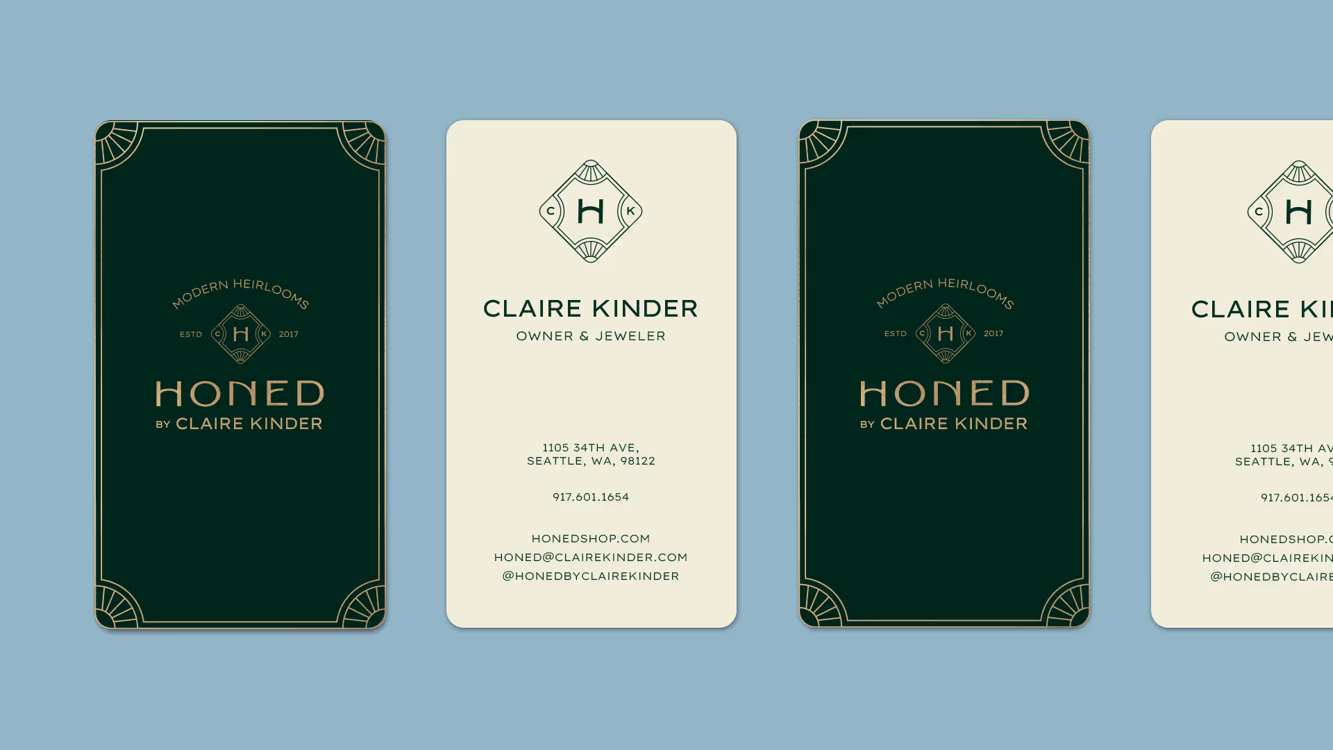
Between business objectives and the brand's core characteristics, we landed on a brand identity that encapsulated the owner's own graceful, architectural flare, as well as the shop's belief in creating modern heirlooms. Deliverables included a brand suite including responsive logos, branded boxes, tissue paper, gift bags, packaging tape, business cards, and care cards.
01. Brand Workshop


Using the brand deck, we talked through current and aspirational brand attributes, separating the cards into piles of "are," "are not," "torn," and "does not apply." After narrowing them down to 8 cards, I organized them into buckets so we could determine the top 3-5 characteristics.
02. Creating a Moodboard

With the client's Pinterest board as a guide, I sourced additional images and stitched them together, revising until we ended with a moodboard that was representative of the core brand characteristics. The visual language is comprised of thin, detailed line work illustration; organic textures; art deco typography; airy photography; and a soft, harmonious balance between curve and corner. The color palette is carried over from the original branding, lending a moody feel to the overall look. This became our North Star for the remainder of the project.
03. Logo Development
I leaned heavily into Art Deco typography, modifying fonts and experimenting with curvature to create that graceful, harmonious balance between curve and corner. The vintage look establishes authority in the brand, while the sans serif keeps it modern.
04. Packaging

packaging moodboard
As a premium brand, the materials used will be high-quality and durable, utilizing hot foil stamping for the majority of logo usage. The unboxing experience includes a luxe gift bag, branded tissue paper and tape, care card, and crushed velvet jewelry box. The client wanted packaging that matched with her shop decor, which featured a tapestry with a pattern of various plants and many real plants dotted around the shop.

SEAMLESS PATTERNS
For the tissue paper, she wanted a seamless pattern depicting the shop's florals. The thin, detailed line work is a nod to vintage botanical illustrations; the plants illustrated are native to the PNW, such as mahonia and rhododendrons.
This pattern has been challenging and is still a work in progress. The revised pattern will feature the same plants crawling across the packaging in a structured manner, as opposed to scattered as they are currently.


.gif)