Designing a suite of marketing assets to promote the rebranded and redesigned Foursquare Swarm app.
Working off of a minimal refreshed brand guide, I ran with the new visual direction to design an animated launch video, App store imagery, emails, and print materials. With just 3 weeks from kickoff to launch, I worked closely with the product manager and CD to script, conceptualize, and execute from end-to-end.
Foursquare's rebrand didn't feel approachable and relevant to our commercial audiences Teams were creating materials on the fly for internal and external use with no focus on brand consistency , as brand assets were scattered across Google Drive with no obvious place for employees to find the materials they needed to create their own client-facing assets With 10+ products under Foursquare's belt that featured disparate product interfaces , we needed a way to create a cohesive visual identity under the larger Foursquare umbrella Deliverables included updated brand guidelines, social templates, presentation decks, sales materials, illustrations, iconography, brand photography, branded imagery, and more.
Our team conducted a brand workshop to break the brand down to its core characteristics, noting what experimental assets resonated with our audiences and what wasn't working. Our overarching brand solutions included:
Creating a scalable visual formula for each facet of the business and its products, leaning heavily into more technical visuals that established baselines cues for our developer and geospatial data focused audiences Curating and designing branded imagery featuring common elements across our materials like POI beacons, latitude/longitude coordinates, analytics panels, movement lines, color overlays, and directional signage Moving away from isometric illustration to more technical illustrations as adaptations of our various products' interfaces To streamline our workflow and make our brand assets user-friendly, we:
Started a new centralized brand repository within Google Drive with a much more intuitive naming and folder structure and reorganized old + new content for easy accessibility Formalized these changes in a new set of comprehensive brand guidelines, documentation, and a press kit and made them available across our existing platforms to enforce brand consistency Created templates in user-friendly platforms like Canva and Google Slides , cutting down the number of asks of the creative team so we could focus on big-picture projects These changes resulted in a more efficient workflow and received positive feedback from both internal stakeholders and external clients who noticed a drastic leap in brand consistency.
Motion design, visual design
Alosha Shkolnik, CD
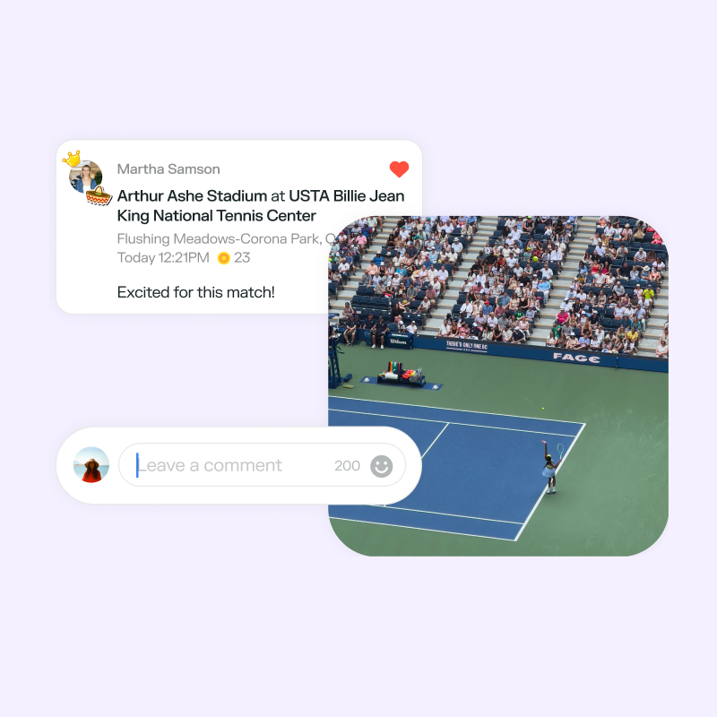
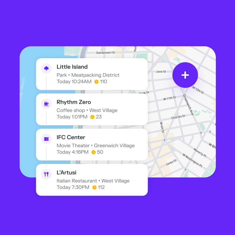
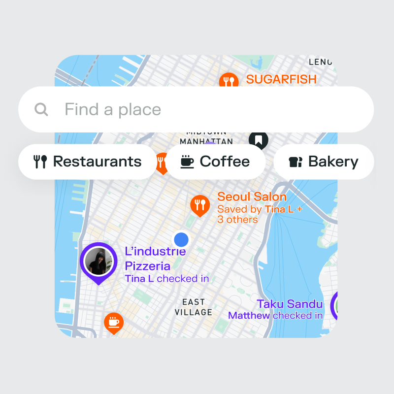
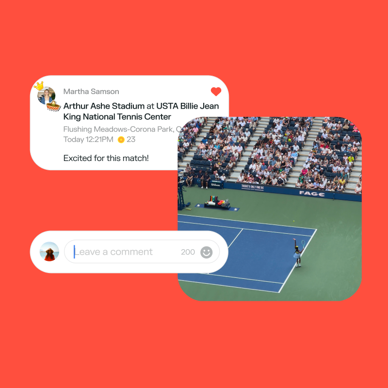
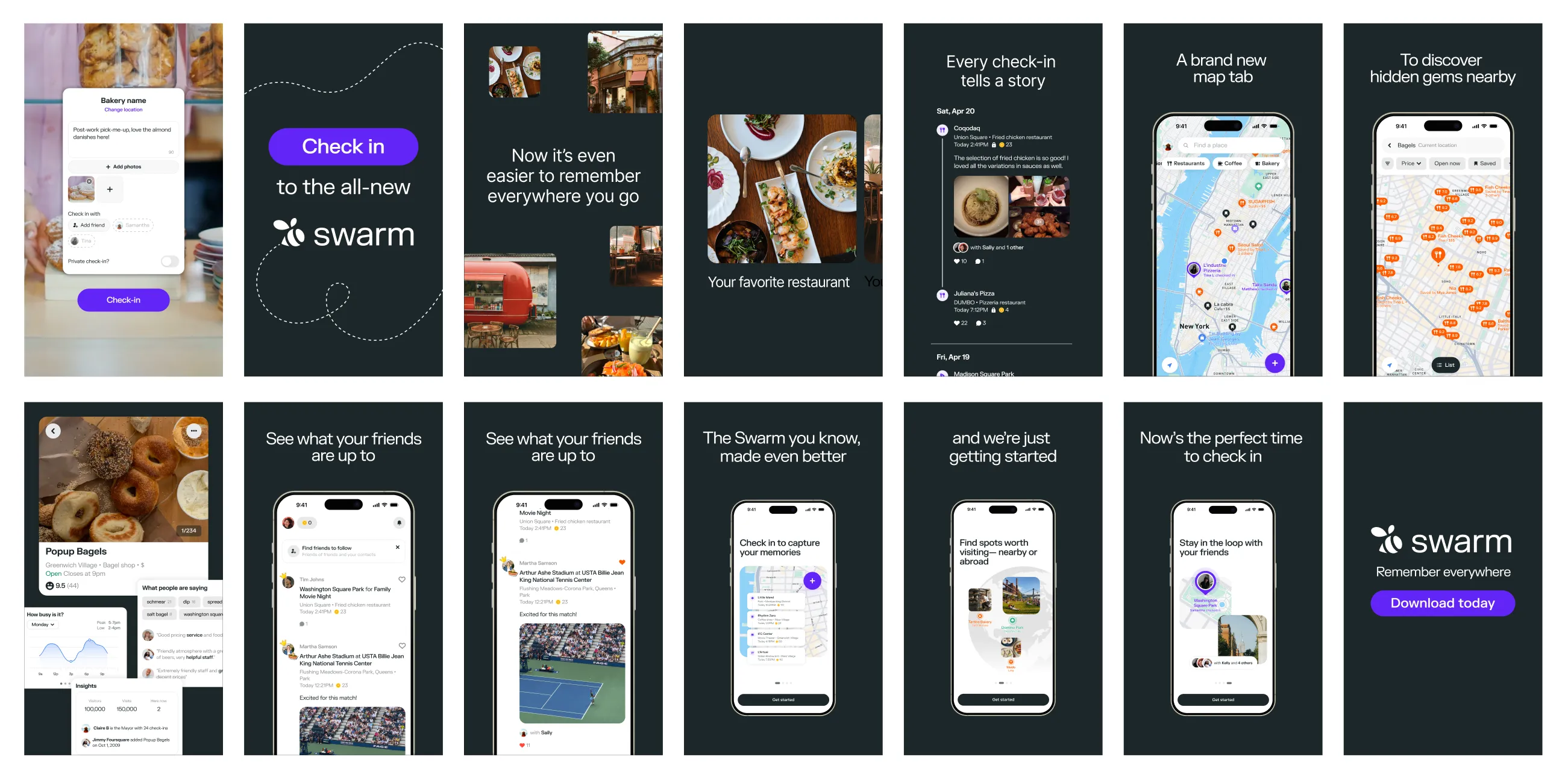
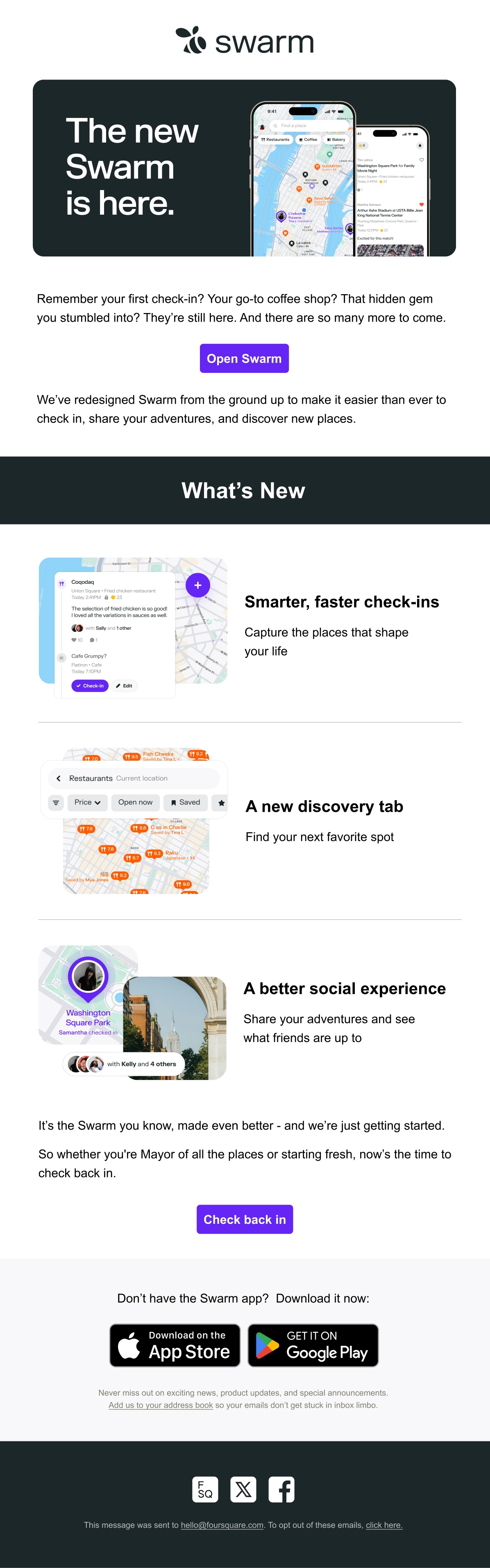
Marketing the relaunch of a refreshed Swarm app Designing a suite of marketing assets to promote the rebranded and redesigned Foursquare Swarm app.
Working off of a minimal refreshed brand guide, I ran with the new visual direction to design an animated launch video, App store imagery, emails, and print materials. With just 3 weeks from kickoff to launch, I worked closely with the product manager and CD to script, conceptualize, and execute from end-to-end.
Foursquare's rebrand didn't feel approachable and relevant to our commercial audiences Teams were creating materials on the fly for internal and external use with no focus on brand consistency , as brand assets were scattered across Google Drive with no obvious place for employees to find the materials they needed to create their own client-facing assets With 10+ products under Foursquare's belt that featured disparate product interfaces , we needed a way to create a cohesive visual identity under the larger Foursquare umbrella Deliverables included updated brand guidelines, social templates, presentation decks, sales materials, illustrations, iconography, brand photography, branded imagery, and more.
Our team conducted a brand workshop to break the brand down to its core characteristics, noting what experimental assets resonated with our audiences and what wasn't working. Our overarching brand solutions included:
Curating and designing branded imagery featuring common elements across our materials like POI beacons, latitude/longitude coordinates, analytics panels, movement lines, color overlays, and directional signage Moving away from isometric illustration to more technical illustrations as adaptations of our various products' interfaces Creating a scalable visual formula for each facet of the business and its products, leaning heavily into more technical visuals that established baselines cues for our developer and geospatial data focused audiences To streamline our workflow and make our brand assets user-friendly, we:
Started a new centralized brand repository within Google Drive with a much more intuitive naming and folder structure and reorganized old + new content for easy accessibility Formalized these changes in a new set of comprehensive brand guidelines, documentation, and a press kit and made them available across our existing platforms to enforce brand consistency Created templates in user-friendly platforms like Canva and Google Slides , cutting down the number of asks of the creative team so we could focus on big-picture projects These changes resulted in a more efficient workflow and received positive feedback from both internal stakeholders and external clients who noticed a drastic leap in brand consistency.
Motion design
Alosha Shkolnik, CD